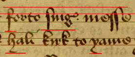
This is a book of religious instruction for private use, and thus less formal than the York Register, which is a civic document. The hand is clear and well-formed, but definitely cursive in quality, and has the familiar ‘pointed’ look of Secretary, though its overall uprightness and some of its letter-forms are intended to suggest its function as a bookhand.
The page is only frame-ruled, and the lines of writing, though they keep within the block, are conspicuously freehand, running uphill in what a graphologist would probably suggest is an optimistic way.

Despite this, they are fairly though not always completely straight if not horizontal, and the letters are fairly even in size.

 |
Pen-width is on the verticals: which gives the script an even look: | |
 |
but the oblique downstrokes are also made with the width of the pen, which makes the script look as if it is lying backwards: the upstrokes are finer. | |
 |
Letters come to a point at the top: | |
 |
 |
even when they are oval ones like a and o. |
The aspect ratio of our test letters is slightly narrower than that of the York Register hand, apart from m, which is wider because more freehand:
 |
 |
 |
| o is 10:7 | m is 1:2 | e is 10:7 |
Ascenders on letters like s,
f, and k nearly as tall as
the body of the text, about 4:6 (ascender:body); h and l
are slightly lower.
Descenders on
s, f, and even h and ţ are
even longer, about 7(body):13(descender).
 |
Loops on ascenders are dramatic and bold,
 |
 |
 |
 |
 |
 |
 |
and often connect with preceding or following letters:
 |
 |
 |
| Double ss and s + t are ligatures |  |
 |
| Double ll and double ff are linked, as before. |  |
 |
Return to Question Page.
Return to Index Page.
© MEG TWYCROSS 2000