Shortcut to Gothic Textura Rotunda.
Page Size
The pages measure 243mm x 165mm (approximately 9˝ x 6˝ inches).
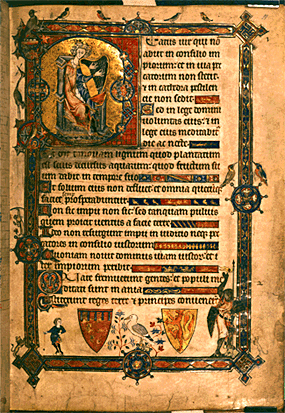
The Alphonso Psalter was written for a prince, possibly as a wedding present. This is the first page of the Psalms.

It features an author portrait, King David playing the harp on a gold-leaf background, with an
episode from his earlier life in the bas de page
(‘bottom of the page’: usually outside the bottom marginal line of decoration, but here
enclosed in the impressive bars which frame the writing area).
 |
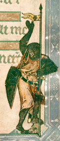
The shepherd boy David aims the stone in his sling at the giant Goliath. (On this Web page, Goliath is much reduced in size.) |  |
 |
The birds are all recognisable species. |  |
 |
There is even a little story going on in the left margin. |  |
Lines are evenly spaced: the space between the written lines is equal to the space between head-line and base-line.

Since ascenders and descenders are very stubby, there is space between the lines. The apparent density of the page’s coverage is due to the heavier verticals.
The text is left-justified, and very precisely right- justified. This is achieved by breaking words at the ends of lines 2, 3, 5 etc. He also uses abbreviations at the ends of lines to save space.
 |
The text is laid out as a psalm, with each verse marked by a coloured versal. |  |
Where the ends of the verses fall short of the right margin, they are right-justified by using ornamental line fillers, with heraldic and other decoration.

Psalm 2 begins at line 22, with a slightly larger initial Q stretching over two lines, decorated with penwork flourishes. The second letter of the word, a U, is also a capital and flourished.

Punctuation
 |
is by colon (on the head- and base-lines) and full stop. These mark out the balance in the verses much as they do in modern editions of the Bible. |  |
Return to top.
Page Size
The page measures approximately 156mm x 107mm (approximately 6.1 x 4Ľ inches). It has been
unevenly trimmed. Text area is 950mm x 680mm.

This is a page from a modest Book of Hours, in the vernacular and therefore for private use, but the treatment is still as lavish as, presumably, the patron could afford.
 |
The initial L at the beginning of the psalm is decorated in gold leaf, and infilled with delicate red penwork. Red penwork flourishes also decorate the left-hand margin. |
 | The text of the psalm is written out continuously to save space, but the verses are marked by versals in alternate blue and red. This appears to be the only punctuation. |  |
 |
Rubrics are written in red ink. |
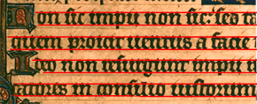
The script is in very black ink. This means that there is fairly heavy show-through. It is written slightly above the ruled lines, which are in dark brown.

The ruling is intended as part of the page decoration. There are double frame-lines at top and bottom of the written area.
Writing is even. The space between written lines is smaller than that between headline and baseline, about 3:4.

This, together with the black ink and relatively wide pen-nib on the downstrokes, gives the page a fairly densely-written look.
 |
The writing is left- and right-justified. Words are broken with hyphens at the right margin, and there are some abbreviations, also usually near the right margin. |
Return to top.
Return to Index Page.
© MEG TWYCROSS 1999