This two part blog will focus on the attendances at an accidentand emergency department (A&E) in a major hospital in the United Kingdom between the beginning of 2016 and the end of 2019. This first blog looks into analysing the relationships between the daily number of admissions/attendances at the hospital’s A&E and patients’ age/referral source/arrival date/time. In the second blog (Daily attendances in accident and emergency departments – Forecasting attendances) we use the information gathered from the exploratory data analysis (EDA) conducted in this first blog to predict the daily number of attendances at the hospital’s A&E.
1. Background
The last few decades prior to COVID-19 pandemic have seen an increase in the number of people admitted to A&E departments. According to Stevenson et al. (2018), part of the increase in emergency admissions is due to the rise in the number of sick people. The current medicine is able to maintain people alive for longer than ever before, although, this does not always mean that these patients are cured. Consequently, these patients are very likely to require treatment again and for more complex needs. Additionally, there exist many other factors which influence the number of admissions. When speaking with people who worked in emergency departments, I learnt from them that non-medical factors such as weather, celebration days and big events can influence admission levels. Nevertheless, these external factor are ignored here and will be the core of future work.
2. Exploratory data analysis of the number of admissions and
attendances at A&E
As part of this project, we will studying the daily number of admissions and attendances in emergency departments, especially knowing what percentage of people attending the emergency departments are then admitted. Furthermore, we will analyse the relationship these have with the patients’ arrival date, arrival time, age and referral source. The data used concerns the daily number of attendances and admissions at A&E from beginning of 2016 to end of 2019. Throughout the two blogs, accident and emergency department (A&E) and emergency department (ED) will be used interchangeably.
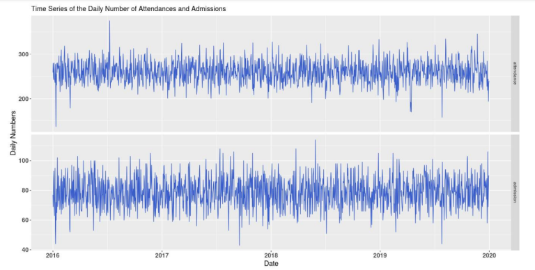
Figure 1: Time series of the daily number of attendances (top) and daily number of admissions (bottom) at the A&E from beginning of 2016 to end of 2019.
2.1 Relationship between the number of admissions/attendances and
patients’ arrival date/time
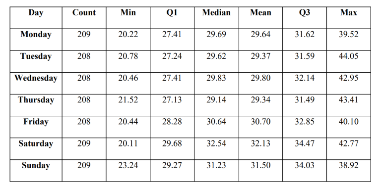
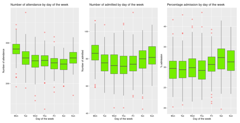
We begin by analysing the relationship attendances and admissions have with days of the week and hours of the day. The sample statistics produced (Tab.1) revealed that Saturday has on average the highest percentage of people being admitted after attending the A&E. Then, boxplots were created to visually represent these relationships (Fig.4). The daily number of attendances and admissions followed a very similar pattern across the days of the week. Days with a higher number of attendances also have a higher number of admissions. Additionally, the percentage of people admitted was relatively constant across the week. The lowest percentage of admission being 29.34% (Thursday) and the highest being 32.13% (Saturday). However, only a very week negative correlation (Pearson coefficient: -0.23) exists between the percentage of people admitted and the number of people attending the A&E each day.
Table 1: Sample statistic for the average percentage of patients being admitted after attending the A&E by days of the week from the beginning of 2016 to the end of 2019.
Figure 2: Boxplots of the daily number of attendances (left), number of admissions (centre) and percentage of admissions (right) by days of the week at the A&E from the beginning of 2016 to the end end of 2019.
Next, the previous analysis was repeated but looking at the relationship with hours of the day. The sample statistic clearly showed that on average the percentage of people being admitted depends on their arrival time. Between 2016 and the end of 2019, 32% of people arriving between 05:00 and 06:00 were on average admitted to the A&E, compared to 17% for those who arrived between 19:00 and 20:00. Moreover, the boxplots reveal that between 02:00 and 06:00 the percentage of patients being admitted increased sharply, followed by a sudden decrease from 06:00 to 09:00. The opposite pattern is observed when looking at the hourly number of attendances at the A&E.
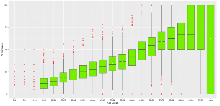
2.2 Relationship between the number of admissions/attendances and patients’ age
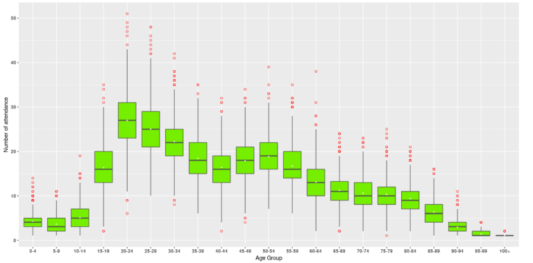
Next we look at the relationship between the patients’ age and the variables of interest, focusing on the daily figures when looking at admissions and attendances. An important point to make is that before being admitted, children under 16 who arrive at the A&E are normally transferred to another hospital specialised for children. This explains why the percentage of people admitted is almost zero for the first three age groups. This will also affect the fourth age group (15-19 years old). Additionally, there is a lot of data (roughly 1460 daily figures) for all age groups where patients are under 95 years old. However, not as much data is available for the two eldest groups. There were 664 days where at least one patient between 95 and 99 years old attended the A&E and only 80 days for patients 100 and over. Keeping this in mind, on average 10.56% of people attending the A&E are between 20 and 24 years old. This figure gradually decreases as we look at elderly age groups, whereas, the percentage of people being admitted progressively increases. Also, there is a slight decrease in the percentage of admission for the 100+ group compared to the 3 groups preceding it.
Figure 3. Boxplot of the total daily number of attendances per age group at the A&E from the beginning of 2016 to the end of 2019.
Figure 4: Boxplot of the daily percentage of patients being admitted per age group at the A&E from the beginning of 2016 to the end of 2019.
2.3 Relationship between the number of admissions/attendances and
patients’ referral source
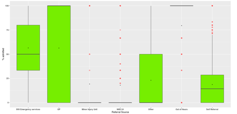
We finally analyse the relationship between admissions and patients’ referral sources. On average, between 2016 and the end of 2019, 63% of people attending the A&E are self-referred and 28% are from 999 emergency services. However, self-referrals represent only 37% of all admissions. The sample statistics shows that on average only 18% of self-referrals are admitted to A&E. Contrarily, patients referred to the A&E from Out of Hours have the highest average admission percentage (80%). However, remember that some patients are not admitted because they are sent elsewhere to receive treatments. Additionally, there is a large difference between the mean and median percentage admission for all referral sources. This is probably due to outliers, such as special circumstances where an unusually high or low percentage of people were admitted.
Figure 5: Boxplot of the daily percentage of patients being admitted per referral source at the A&E from beginning of 2016 to the end of 2019.
2.4 Exploratory data analysis of the time series for daily number of Attendances at A&E
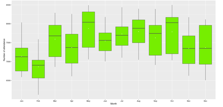
Before trying to model the attendances at A&E, it is good practice to look for patterns in the data and identify their main characteristics. To simplify the analysis, all of 2020 data has been removed as A&E attendances have been affected by COVID-19. Only data from January 1st, 2012 till December 31st 2019 has been used. As seen in the previous section, the average number of attendances at the A&E differ by day of the week. The average number of attendances also seems to differ every month (Fig.6). It appears that summer months have on average a higher number of attendances than winter months. However, there is a sudden drop in attendances in June. Also, December might have a higher number of attendances than expected due to it being a period of celebration which is known to cause an increase in the number of accidents.
Figure 6: Boxplot of the daily number of attendances at the A&E by months between 2012 and the end of 2019.
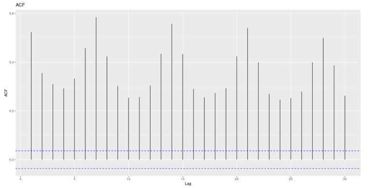
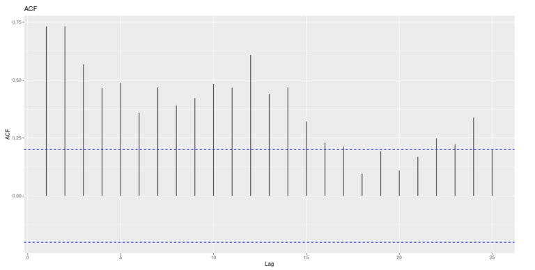
To confirm the presence of both weekly and yearly seasonality in the data, Autocorrelation Function (ACF) plots (Fig.7, Fig.8) and Partial Autocorrelation Function (PACF) plots were created. The ACF plot corresponding to daily attendances shows significant spikes at lags which are multiples of 7. The one for monthly attendances has significant spikes at lags 12 and 24. This confirms the presence of weekly and yearly seasonality in the data. In both ACF plots, the size of the spikes decreases as the lags increase, which is due to the presence of trend in the data.
Figure 7: ACF plot of daily attendances at the A&E.
Figure 8: ACF plot of monthly attendances at the A&E.
In the next blog we will use the information we have from the EDA and attempt to forecast the the daily number of attendances at A&E. (Click here)