Up until now my graph plotting skills in R have been severely lacking! Usually consisting of a lot of googling until I find an example that is as similar as possible to what I want and amending to fit my data and task. I thought therefore that I’d teach myself by creating this post and hopefully it is useful to others.
The package that I’ll be looking at here is ggplot2 which is a data visualisation package and seems to be the main package used for creating many different types of graphs with a good degree of customisation freedom and a professional look. After looking into the motivation behind each of the elements in the code which gets used, ggplot2 is actually quite intuative. My issues previously seem to stem from the fact that I had never seen the compilation of elements broken down into their components and as a whole I found this package pretty confusing.
Creating a plot requires two stages to be completed. First you set up the plot to create a blank skeleton of a plot and then you add layers to this to add content and features to the plot such as data points and titles.
Set up the plot:
First we start with the ggplot() function and within this the most important arguments are
- data – self explanatory, this is just the data that you are wanting to plot.
- mapping – this will be in the form aes(x,y) where x will be used to scale the x-axis and y will be used to scale the y-axis.
Any plot created using the ggplot2 package must start with the ggplot(), though you can leave all the arguments blank and specify the data and mapping in the layers. You might do this if you are using multiple dataframes to produce different graphics on the same plot. However if you are only using a single dataframe and consitant mapping then you specify them in the ggplot() function.
Adding layers:
We add layers to our ggplot() function using the + symbol. These layers add the actual content of the graph. Some examples of layers we can add are:
- Geom_point() adding this to our ggplot without any arguments adds a scattergraph of the points from the data specified in the ggplot() function.
- Geom_smooth() we can add a line of best fit for the data given in the ggplot() step to our scatter graph by adding this without any arguments.
The possible arguments for each layer but while adding a layer without arguments means it will just use the data specified in the ggplot() part, if you want to use a different set of data this is where you could do it. This makes it easy for comparisons between different variables or sets of data.
Let’s see a step by step build up of a plot:
I’m using the covid19 package to access datasets relating to the pandemic, I thought it would be interesting to compare vaccination rates for a few countries. First I extracted the data using the COVID19 package for my chosen countries and due to the data available I had to create the “Percentage Vaccinated” column from the number vaccinated and the population.
COVIDSubset <- covid19(country=c("United Kingdom",'US','Italy','Spain'))


COVIDSubset$PercentVaccinated <-  100*COVIDSubset$vaccines/COVIDSubset$population
Now I can begin creating the plot. First I start with the ggplot() basis with my data and chosen x and y variables. This creates an empty plot as there are no layers yet so there is no data to display. The use of the colour arguments in aes() will mean when I add layers these are split into categories based on the variable I put in there and are coloured differently due to this. The software will automatically create a legend for me once layers are added but this is missing for now. Here I have chosen to split the data by country using the id column in the data.
ggplot(data=COVIDSubset, aes(x=date,y=PercentVaccinated, colour= id))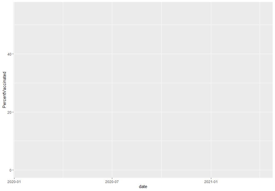
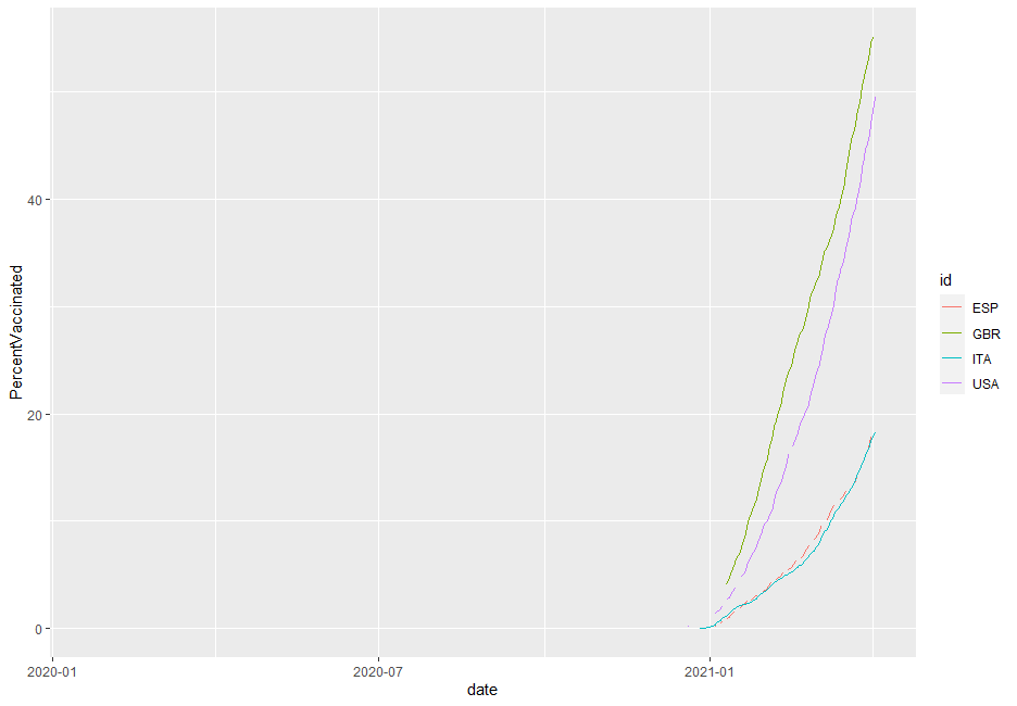
Next I’ll add a single layer just to show how it can build up. Given the data I want to look at I have chosen the geom_line() layer
ggplot(data=COVIDSubset, aes(x=date,y=PercentVaccinated, colour= id)) + geom_line()
Due to missing data causing breaks in the line I’ve decided to swap to use geom_smooth() instead of geom_line() to get a line of best fit. Now I’ll add more layers, these are:
- labs() for axis labels and legend label (this is set using the colour arguments).
- xlim() to reduce the range of the x-axis to a more suitable range.
- scale_colour_discrete() to rename the labels for the legend.
- ggtitle() to set a title
- theme() with plot.title = element_text(hjust = 0.5) arguments to centre the title as the default has it left aligned.
ggplot(data=COVIDSubset, aes(x=date,y=PercentVaccinated, colour= id)) +
  geom_smooth() +
  labs(x="Month", y="Percentage vaccinated (%)", colour="Country") +
  xlim(as.Date(c("2020-12-01", "2021-03-16"))) +
  scale_colour_discrete(labels = c("Spain", "UK", "Italy","USA")) +
  ggtitle("Percentage of Total Population Vaccinated by Country") +
  theme(plot.title = element_text(hjust = 0.5))
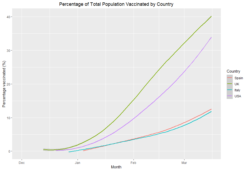
Looks like we are doing quite well in the vaccine game in comparison to Spain and Italy with the US doing alright but not quite as well. This plot was nice and easy to make and make small changes to. There are many interesting styles of plots that can be created using the ggplot2 package beyond just line graphs however this seemed like a good start. The ggplot2 link in the references below has an extremely useful cheatsheet which details most of the possible layers you can add and options you may have within them. The key idea here is to remember it is all about adding the layers and building the graph up. You need to think of what you want to see graphically and then break that down into the steps that will be needed to build it.
References
ggplot2 – Create Elegant Data Visualisations Using the Grammar of Graphics • ggplot2 (tidyverse.org)
COVID19: R Interface to COVID-19 Data Hub – CRAN – Package COVID19 (r-project.org