Anomaly detection in Functional Data
As discussed in my previous blog post, Functional data appears in various disciplines and each observation can be considered as real function of time observed at particular time points. Anomaly detection can be more challenging in terms of functional data because outliers are not always easily identified visually.
Various methods are being developed to identify outliers in functional data. I’ve defined variety of outliers in functional data in my previous post, of which shape outliers is the most difficult to identify. I will discuss one of the method in identifying outliers in functional data we explored as a team during STOR608 sprints, as it was a great and interesting learning experience for me.
Functional depth
The anomaly detection techniques in the methods I will discuss depends on something called ‘Functional depth’. It is nothing but a specific ordering of the curves. There are various definitions/ways in literature to order these functional observations {Y_i(t)}, i = 1, 2,...,N, t \in \mathcal I , where \mathcal I is closed real interval discretized into M points. Modified Band Depth is one of the way.
- Modified Band Depth (MBD): MBD is defined based on the number of times a given curve is completely contained within the range defined by two other curves from sample. Hence, MBD indicates how central the curve is. Higher the MBD value, more central the curve is. The sample curves are ordered in decreasing value of their MBD implying first curve to be the median curve and last curve as the outlier. This article can give more insight on this topic if you would like to know more. MBD is highly used due to its computational efficiency.
Anomaly Detection Methods
Functional boxplot
Functional box plot can be a best option to identify and classify shape, magnitude and amplitude outliers. However, functional boxplot easily identifies magnitude outliers but sometimes fail to detect shape outliers. By performing some sequential curve transformations we could convert the shape outliers to magnitude outliers and identify them. This idea has been proposed in this paper and could be an interesting read.
To construct a functional boxplot, we need to order the curves according to their MBD value. We then find a central region which is analogous to the the inter-quartile range (IQR) for the classical boxplot and is a useful indication of the spread of the central 50% of the curves. The box in a classical boxplot works similar as such with he border of the 50% central region also called as the envelope.
A functional boxplot identifies the anomalies by extending the 1.5 times the empiricial outlier criterion used for the classical boxplot. If a curve Y(t) sits outside of the enclosure formed by inflating the 50 percent central zone by 1.5 times the range of the central region, it is considered an anomaly. Mathematically, a curve Y(t) is an anomaly if,
Y(t) > q_{0.75}(t) + 1.5(q_{0.75}(t) − q_{0.25}(t) or Y (t) < q_{0.25}(t) − 1.5(q_{0.75}(t) − q_{0.25}(t)).
Sequential Transformations
As mentioned earlier, we transform shape and amplitude outliers into magnitude outliers via some curve transformations. I will discuss just one of the algorithm that has proven to be effective while there are other transformations that exist in reality details of which could be found in this paper.
Algorithm
- Identify anomalies using the functional boxplot constructed with MBD. Anomalies detected at this stage are defined as T_0 -anomalies (magnitude anomalies).
- Apply a vertical alignment transformation (T_1) to the data
- T_1(Y_i(t)) = Y_i(t) - \frac{1}{M}\sum_{t=1}^{M} Y(t) \forall i = 1,2....,N
- Repeat step 1 on the transformed data; anomalies detected at this stage are defined as (T_1) -anomalies (amplitude anomalies).
- Apply a normalisation transformation (T_2) to the (T_1) data:
- T_2 (Y_i(t)) = \frac {T_1(Y_i(t))}{||T_1(Y_i(t))||_2}
- Repeat step 1 on the transformed data; anomalies detected at this stage are defined as (T_2) -anomalies (shape anomalies).
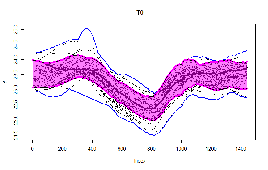
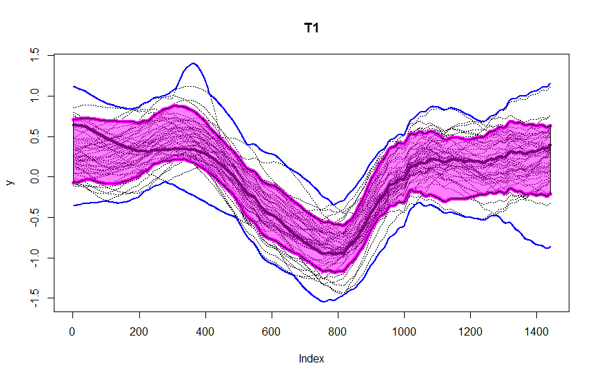
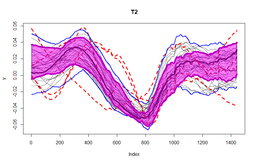
These figures are from the data we were given during the sprints, as a part of our assignment. The data consists of observations for one variable, recorded at one minute intervals over 50 days. We segment it into periods of length M = 1440 for each of the 50 days. You could observe the central region in pink, blue lines being the envelope. After T_2 transformation, we could observe four outliers in red dashed lines detected using this method.
Further Reading
I would like to add few papers that could be of interest and we referenced while working.
- Dai, W., Mrkvicka, T., Sun, Y., and Genton, M. G. (2020). Functional outlier detection and taxonomy by sequential transformations. Computational Statistics & Data Analysis.
- Arribas-Gil, A. and Romo, J. (2014). Shape outlier detection and visualization for functional data: the outliergram. Bio-statistics.
- Sun, Y. and Genton, M. G. (2011). Functional boxplots. Journal of Computational and Graphical Statistics
- Lopez-Pintado, S. and Romo, J. (2009). On the concept of depth for functional data. Journal of the American statistical Association
- Ojo, O. T., Fernández Anta, A., Lillo, R. E., Sguera, C. (2021). Detecting and classifying outliers in big functional data. Advances in Data Analysis and Classification
I would also like to acknowledge that the works presented here were worked in group as a part of sprints. I hope you enjoyed this blog. For further queries, you could always contact me through mail or message me here.

You May Also Like
2 Comments
graliontorile
This actually answered my drawback, thanks!
카지노사이트
I am hoping to give a contribution & help other customers like its helped me. Good job. 카지노사이트