

Spatial modelling of SARS-CoV-2 in the UK: putting theory into practice

Throughout the SARS-CoV-2 epidemic in the UK, members of Bayes4Health have been providing information and evidence to SAGE, the Government committee responsible for presenting scientific evidence to ministers in the event of an emergency, via the the SPI-M subcommittee that draws together national expertise on epidemic modelling. In particular, the “epidemics” division of the project has been focused on providing detailed spatial analyses and predictions of cases numbers in the UK, building on the principles of our seminal work in spatial epidemic modelling for livestock diseases such as avian influenza and foot and mouth disease.
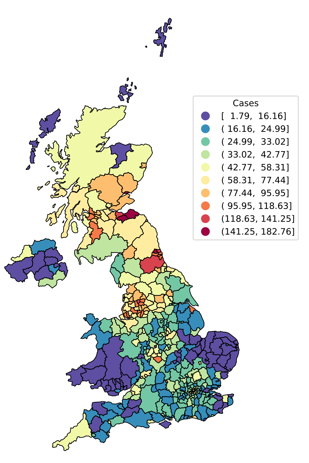
Local Authority District level incidence of SARS-CoV-2 positive tests expressed as cases per 100k individuals per day on 2nd July 2021. The importance of space can be seen clearly, with “hotspots” of high incidence in the North West and North East of England, and central Scotland.
Stochastic SEIR modelling of SARS-CoV-2
In Bayes4Health, we have a particular research focus on spatial stochastic modelling of infectious diseases. As we’ve seen throughout SARS-CoV-2, there are considerable differences in how the outbreak has unfolded in different parts of the country, and dividing the UK into Local Authority Districts (LADs) allows us to capture this heterogeneity (Figure 1). However, modelling cases at LAD level leads to a problem: the finer one splits up the country into spatial units the noisier the case data becomes, particularly in LADs with small numbers of cases. Modelling at the fine spatial scale therefore requires a stochastic model, contrasting to the deterministic differential equation models commonly used when modelling cases at the national or broad regional level.
In our model, we adopt a state transition model where we think of each person in a LAD as existing in one of 4 possible states: S, E, I, and R. Individuals start out as susceptible (S) to the disease, and then at some point may become exposed (E) meaning that they have caught the disease but are not yet infectious. After a period of time, they then transition to being infectious (I) to other individuals, and are finally removed (R) from the epidemic process either by being immune to further infection or by death.

Diagrammatic representation of the SEIR model. Infected individuals infect susceptibles, causing them to transition from S to E. Positive test cases represent observations of the I to R transition, but S to E (infection) and E to I (onset of infectiousness) transitions are unobserved.
On each day of the epidemic, we think of a metaphorical coin being tossed for each individual which determines who transitions S→E, E→I, and I→R. The probability of the coin coming up heads (i.e. that the individual makes the transition) is then taken to be a function of time, space, and the average characteristics of an individual in each LAD. Importantly, for an individual in a given LAD, the S→E (i.e. infection) probability is governed by the current number of infected (I) individuals, considering infection challenge coming from within their own LAD as well as from all other LADs via known human mobility data collected by the Office for National Statistics.
Model fitting
In epidemic modelling, there are lots of unknowns. How many further people does an infected individual infect? How quickly are people becoming infected in a given LAD at a given time? For how long is an individual infectious? How important is infection due to human mobility around the country? These questions must be answered in order to provide meaningful measures of risk and accurate predictions of the ongoing epidemic. The answers, in turn, are provided by statistically fitting our model to observed case data.
Fitting the stochastic SEIR model to observed cases is not so straightforward, however. Whilst we can make an argument for the detection of a positive case being equivalent to the I→R transition (since hopefully people self-isolate, effectively removing them from the epidemic), we never directly observe either S→E or E→I events. Think about it: you only know you’ve caught a cold once you start sneezing, by which time you’ve been walking around for 2 or 3 days infecting other people. Moreover, at any given time during the epidemic, there may be exposed (E) or infected (I) people lurking in the population but we won’t directly observe them until they undergo their I→R transition and we observe them as a case! The S→E and E→I events are therefore censored.
We’ve worked previously on this problem for livestock diseases such as foot and mouth disease, embedding our model within a Bayesian framework and using Markov chain Monte Carlo (MCMC) algorithms to effectively estimate the number and timing of censored transition events, and thereby provide unbiased estimates of the transition rates and generate accurate predictions. We have extended this methodology to work on SARS-CoV-2 (and at the time of writing are preparing for publication), implementing the model, forward simulation and MCMC algorithms using the powerful Tensorflow Probability library in Python.
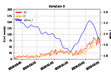
An animation of how the MCMC algorithm explores the possible configurations of censored S→E (orange) and E→I (red) events over time, superimposed on the estimated time-varying baseline infection rate (blue). At the beginning of the algorithm run (Iteration 0), we can see how the MCMC “fills in” the number of lurking S→E and E→I events to be consistent with the epidemic model, avoiding a downward bias at the right hand end of the time-varying infection rate timeseries.
Results and predictions
In epidemiology, maps are everything and we therefore present most of our results geographically. In particular, we produce daily estimates of the LAD-level reproduction number as well as projections of the epidemic model forward in time to calculate both likely case incidence (number of cases per LAD per day) and prevalence (number of exposed and infected individuals per LAD expressed as a proportion). Some of these figures can be seen below, but since disease data requires both space and time dimensions to be represented we also display our results on our Dynamic Health Atlas webapp.
A large part of our SARS-CoV-2 effort at Lancaster has been in Research Software Engineering, and we have relied heavily on hardware support from Lancaster University’s Information Systems Services who run the high-performance computer and VM cloud. We have an automated pipeline that runs nightly, downloading case data from https://coronavirus.data.gov.uk, running the MCMC and prediction algorithms, and building PDF reports and the Dynamic Health Atlas. Summaries of our results are sent up to SAGE, Cabinet Office, and local public health authorities on a weekly basis, and help to inform policy decisions on health resourcing, disease management, and identification of new outbreak hotspots. Watch out for a future blog post in which we’ll describe the details of how we implemented our automated analysis as a health informatics pipeline.

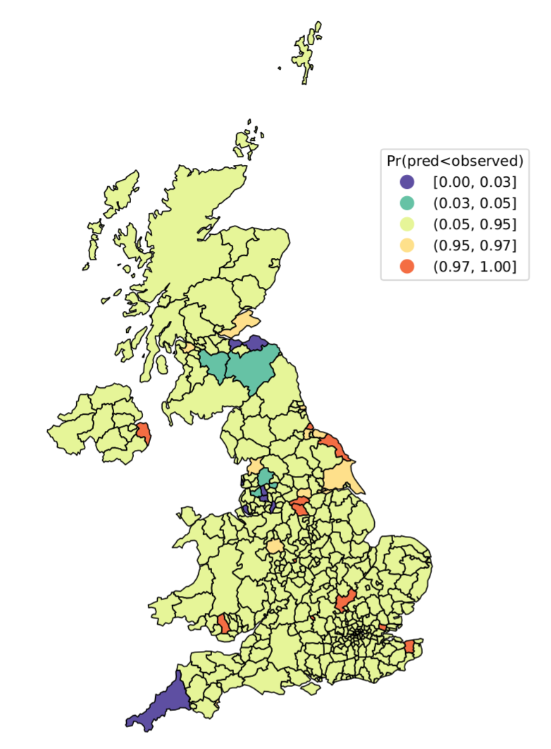
SARS-CoV-2 metrics as of 2nd July 2021. Left: LAD-level reproduction number; Right: highlighting “hotspot” LADs with higher (orange) or “coldspot” LADs with lower (blue) numbers of cases in the past week, relative to model-based predictions.

Estimated national-level reproduction number through time since early April 2021.
Back to News